오늘은 Slide형태의 메뉴를 구현 해보도록 하겠습니다. 예전에 옥션이였나 G마켓이였나에서 본적이 있는 메뉴인데 생각이 나서 만들어 보았습니다. 아래는 시연동영상입니다.
1~6번까지 메뉴가 있으며 해당 번호를 클릭하면 슬라이드 되면세 해당 위치로 이동하게됩니다. 메뉴하나하나에 광고를 넣어서 광고용으로 사용해도 될것같습니다. XAML을 사용해서 기본적인 내용을 구성했으며 C#에서는 이벤트에 따른 Animation호출 부분을 구현했습니다. 먼저 아래는 XAML 소스코드입니다.
- <WINDOW title="Image Slide View - WPF KOREA(Http://whatisthat.co.kr)" xmlns="http://schemas.microsoft.com/winfx/2006/xaml/presentation" Height="275" Width="605" x:Class="ImageView.Window1" xmlns:x="http://schemas.microsoft.com/winfx/2006/xaml" ResizeMode="NoResize">
- <WINDOW.RESOURCES>
- <DOUBLEANIMATION x:Key="MoveAnimation" Storyboard.TargetName="Panels" Storyboard.TargetProperty="(Canvas.Left)" SpeedRatio="2" />
- </WINDOW.RESOURCES>
- <GRID>
- <CANVAS Height="250" Width="600" ClipToBounds="True">
- <STACKPANEL Height="250" x:Name="Panels" Orientation="Horizontal" Canvas.Left="0">
- <IMG height=250 width=600 Source="1.jpg">
- <IMG height=250 width=600 Source="2.jpg">
- <IMG height=250 width=600 Source="3.jpg">
- <IMG height=250 width=600 Source="4.jpg">
- <IMG height=250 width=600 Source="5.jpg">
- <IMG height=250 width=600 Source="6.jpg">
- </STACKPANEL>
- </CANVAS>
- <STACKPANEL Height="30" VerticalAlignment="Bottom" HorizontalAlignment="Right" Margin="5" Orientation="Horizontal">
- <STACKPANEL.RESOURCES>
- <STYLE TargetType="TextBlock">
- <Setter Property="FontSize" Value="30"/>
- <Setter Property="Width" Value="25"/>
- <Setter Property="Foreground" Value="White"/>
- <Setter Property="FontFamily" Value="Verdata"/>
- <Setter Property="FontStyle" Value="Italic"/>
- <Setter Property="FontWeight" Value="Bold"/>
- <Setter Property="Cursor" Value="Hand"/>
- <Setter Property="Opacity" Value="0.5"/>
- <Style.Triggers>
- <Trigger Property="IsMouseOver" Value="True">
- <Setter Property="Opacity" Value="1"/>
- </Trigger>
- </Style.Triggers>
- </STYLE>
- </STACKPANEL.RESOURCES>
- <TEXTBLOCK Text="1" MouseDown="Button_Click" />
- <TEXTBLOCK Text="2" MouseDown="Button_Click" />
- <TEXTBLOCK Text="3" MouseDown="Button_Click" />
- <TEXTBLOCK Text="4" MouseDown="Button_Click" />
- <TEXTBLOCK Text="5" MouseDown="Button_Click" />
- <TEXTBLOCK Text="6" MouseDown="Button_Click" />
- </STACKPANEL>
- </GRID>
- </WINDOW>
다음은 C# 코드입니다.
- private void Button_Click(object sender, RoutedEventArgs e)
- {
- DoubleAnimation MoveAnimation = Resources["MoveAnimation"] as DoubleAnimation;
- TextBlock SelectedTextBlock = sender as TextBlock;
- MoveAnimation.To = -(int.Parse(SelectedTextBlock.Text) - 1) * 600;
- Panels.BeginAnimation(Canvas.LeftProperty, MoveAnimation,HandoffBehavior.Compose);
- }
private void Button_Click(object sender, RoutedEventArgs e)
{

    DoubleAnimation MoveAnimation = Resources["MoveAnimation"] as DoubleAnimation;
    TextBlock SelectedTextBlock = sender as TextBlock;
    MoveAnimation.To = -(int.Parse(SelectedTextBlock.Text) - 1) * 600;

    Panels.BeginAnimation(Canvas.LeftProperty, MoveAnimation,HandoffBehavior.Compose);
}
크기가 일정한 내용의 메뉴 페이지를 StackPanel을
사용해 순차적으로 쌓아놓고 버튼을 클릭하면 버튼에 많는 만큼 StackPanel을 이동하는 방법을 이용해 구현 했습니다. 간단하죠? 기타 질문은 리플이나 메일로 주시면 답변해드리겠습니다 ^^

안녕하세요. 이번시간에는 현재 옥션에서 사용중인 Image Banner를 구현해보도록 하겠습니다. 여러개의 배너(혹은 광고물)이 책장이 넘어가듯이 넘어가는 효과로 이벤트 광고나 베너용으로 활용하면 좋을것 같습니다. 아래는 시연 동영상 입니다.
XAML을 사용해서 기본적인 내용을 구성했으며 C#에서는 이벤트에 따른 Animation호출 부분을 구현했습니다. 먼저 아래는 XAML 소스코드입니다.
- <WINDOW title="Flip Image Banner - WPF KOREA(http://whatisthat.co.kr)" xmlns="http://schemas.microsoft.com/winfx/2006/xaml/presentation" Background="Red" Height="275" Width="605" x:Class="FlipImage.Window1" xmlns:x="http://schemas.microsoft.com/winfx/2006/xaml">
- <WINDOW.RESOURCES>
- <STORYBOARD FillBehavior="Stop" x:Key="TopAnimation" Storyboard.TargetName="TargetTop">
- <DOUBLEANIMATION Storyboard.TargetName="TopSkew" From="0" Duration="0:0:0.1" To="-10" Storyboard.TargetProperty="(SkewTransform.AngleX)" />
- <DOUBLEANIMATION Storyboard.TargetName="TopScale" From="1" Duration="0:0:0.25" To="0" Storyboard.TargetProperty="(ScaleTransform.ScaleY)" />
- </STORYBOARD>
- <STORYBOARD FillBehavior="Stop" x:Key="BottomAnimation" Storyboard.TargetName="TargetTop">
- <DOUBLEANIMATION Storyboard.TargetName="BottomSkew" From="10" Duration="0:0:0.25" To="0" Storyboard.TargetProperty="(SkewTransform.AngleX)" BeginTime="0:0:0.25" />
- <DOUBLEANIMATION Storyboard.TargetName="BottomScale" From="0" Duration="0:0:0.25" To="1" Storyboard.TargetProperty="(ScaleTransform.ScaleY)" BeginTime="0:0:0.25" />
- <DOUBLEANIMATION Storyboard.TargetName="BottomSkew" From="0" Duration="0:0:0.1" To="5" Storyboard.TargetProperty="(SkewTransform.AngleX)" BeginTime="0:0:0.5" AutoReverse="True" />
- <DOUBLEANIMATION Storyboard.TargetName="BottomScale" From="1" Duration="0:0:0.1" To="0.9" Storyboard.TargetProperty="(ScaleTransform.ScaleY)" BeginTime="0:0:0.5" AutoReverse="True" />
- </STORYBOARD>
- <IMAGEBRUSH x:Key="TopBrush" Viewbox="0,0,1,0.5" />
- <IMAGEBRUSH x:Key="BottomBrush" Viewbox="0,0.5,1,0.5" />
- </WINDOW.RESOURCES>
- <GRID Background="Black" Height="250" Width="600">
- <RECTANGLE Height="125" Fill="{StaticResource TopBrush}" VerticalAlignment="Top" x:Name="OriginalTop" />
- <RECTANGLE Height="125" Fill="{StaticResource BottomBrush}" VerticalAlignment="Bottom" x:Name="OriginalBottom" />
- <RECTANGLE Height="125" Fill="{StaticResource TopBrush}" VerticalAlignment="Top" x:Name="TargetTop" RenderTransformOrigin="0.5,1">
- <RECTANGLE.RENDERTRANSFORM>
- <TRANSFORMGROUP>
- <SKEWTRANSFORM x:Name="TopSkew" AngleX="0" />
- <SCALETRANSFORM x:Name="TopScale" ScaleY="1" />
- </TRANSFORMGROUP>
- </RECTANGLE.RENDERTRANSFORM>
- </RECTANGLE>
- <RECTANGLE Height="125" Fill="{StaticResource BottomBrush}" VerticalAlignment="Bottom" x:Name="TargetBottom" RenderTransformOrigin="0,0">
- <RECTANGLE.RENDERTRANSFORM>
- <TRANSFORMGROUP>
- <SKEWTRANSFORM x:Name="BottomSkew" AngleX="0" />
- <SCALETRANSFORM x:Name="BottomScale" ScaleY="1" />
- </TRANSFORMGROUP>
- </RECTANGLE.RENDERTRANSFORM>
- </RECTANGLE>
- <STACKPANEL Height="30" VerticalAlignment="Bottom" HorizontalAlignment="Right" Margin="20" Orientation="Horizontal">
- <STACKPANEL.RESOURCES>
- <STYLE TargetType="TextBlock">
- <Setter Property="FontSize" Value="30"/>
- <Setter Property="Width" Value="25"/>
- <Setter Property="Foreground" Value="White"/>
- <Setter Property="FontFamily" Value="Verdata"/>
- <Setter Property="FontStyle" Value="Italic"/>
- <Setter Property="FontWeight" Value="Bold"/>
- <Setter Property="Cursor" Value="Hand"/>
- <Setter Property="Opacity" Value="0.5"/>
- <Style.Triggers>
- <Trigger Property="IsMouseOver" Value="True">
- <Setter Property="Opacity" Value="1"/>
- </Trigger>
- </Style.Triggers>
- </STYLE>
- </STACKPANEL.RESOURCES>
- <TEXTBLOCK Text="1" MouseDown="Button_Click" />
- <TEXTBLOCK Text="2" MouseDown="Button_Click" />
- <TEXTBLOCK Text="3" MouseDown="Button_Click" />
- <TEXTBLOCK Text="4" MouseDown="Button_Click" />
- <TEXTBLOCK Text="5" MouseDown="Button_Click" />
- <TEXTBLOCK Text="6" MouseDown="Button_Click" />
- </STACKPANEL>
- </GRID>
- </WINDOW>
다음은 C# 코드입니다.
- public partial class Window1 : Window
- {
- public Window1()
- {
- InitializeComponent();
- OriginalTop.Fill = (Resources["TopBrush"] as ImageBrush).Clone();
- OriginalBottom.Fill = (Resources["BottomBrush"] as ImageBrush).Clone();
- TargetTop.Fill = (Resources["TopBrush"] as ImageBrush).Clone();
- TargetBottom.Fill = (Resources["BottomBrush"] as ImageBrush).Clone();
- (Resources["BottomAnimation"] as Storyboard).Completed += new EventHandler(BottomAnimation_Completed);
- (Resources["TopAnimation"] as Storyboard).Completed += new EventHandler(TopAnimation_Completed);
- }
- private void Button_Click(object sender, RoutedEventArgs e)
- {
- TextBlock SelectedTextBlock = sender as TextBlock;
- ChangeTarget("pack://Application:,,,/" + SelectedTextBlock.Text + ".jpg");
- }
- private void ChangeTarget(String Source)
- {
- ImageSource OrigianlSource = (TargetTop.Fill as ImageBrush).ImageSource as ImageSource;
- ImageSource TargetSource = new BitmapImage(new Uri(Source));
- BottomScale.ScaleY = 0;
- (OriginalTop.Fill as ImageBrush).ImageSource = TargetSource;
- (TargetTop.Fill as ImageBrush).ImageSource = OrigianlSource;
- (TargetBottom.Fill as ImageBrush).ImageSource = TargetSource;
- (Resources["TopAnimation"] as Storyboard).Begin(this);
- (Resources["BottomAnimation"] as Storyboard).Begin(this);
- }
- void TopAnimation_Completed(object sender, EventArgs e)
- {
- (TargetTop.Fill as ImageBrush).ImageSource = (TargetBottom.Fill as ImageBrush).ImageSource as ImageSource;
- }
- void BottomAnimation_Completed(object sender, EventArgs e)
- {
- (OriginalBottom.Fill as ImageBrush).ImageSource = (TargetBottom.Fill as ImageBrush).ImageSource as ImageSource;
- }
- }
public partial class Window1 : Window
{

    public Window1()
    {
        InitializeComponent();

        OriginalTop.Fill = (Resources["TopBrush"] as ImageBrush).Clone();
        OriginalBottom.Fill = (Resources["BottomBrush"] as ImageBrush).Clone();
        TargetTop.Fill = (Resources["TopBrush"] as ImageBrush).Clone();
        TargetBottom.Fill = (Resources["BottomBrush"] as ImageBrush).Clone();

        (Resources["BottomAnimation"] as Storyboard).Completed += new EventHandler(BottomAnimation_Completed);
        (Resources["TopAnimation"] as Storyboard).Completed += new EventHandler(TopAnimation_Completed);

    }

    private void Button_Click(object sender, RoutedEventArgs e)
    {
        TextBlock SelectedTextBlock = sender as TextBlock;
        ChangeTarget("pack://Application:,,,/" + SelectedTextBlock.Text + ".jpg");
    }

    private void ChangeTarget(String Source)
    {
        ImageSource OrigianlSource = (TargetTop.Fill as ImageBrush).ImageSource as ImageSource;
        ImageSource TargetSource = new BitmapImage(new Uri(Source));

        BottomScale.ScaleY = 0;

        (OriginalTop.Fill as ImageBrush).ImageSource = TargetSource;
        (TargetTop.Fill as ImageBrush).ImageSource = OrigianlSource;
        (TargetBottom.Fill as ImageBrush).ImageSource = TargetSource;

        (Resources["TopAnimation"] as Storyboard).Begin(this);
        (Resources["BottomAnimation"] as Storyboard).Begin(this);
    }
    void TopAnimation_Completed(object sender, EventArgs e)
    {
        (TargetTop.Fill as ImageBrush).ImageSource = (TargetBottom.Fill as ImageBrush).ImageSource as ImageSource;
    }

    void BottomAnimation_Completed(object sender, EventArgs e)
    {
        (OriginalBottom.Fill as ImageBrush).ImageSource = (TargetBottom.Fill as ImageBrush).ImageSource as ImageSource;
    }
}
Skew Transform과 ScaleTransform을 사용해서 간단하게 책장을 넘어가는 효과를 구현했습니다. 그리고 현재 페이지(위쪽,아래쪽) 다음페이지(위쪽 아래쪽)을 표현하기 위해서 4개의 객체로 분리해서 사용했으며 ChangeTarget 함수를 이용합니다. 시간관계상 설명은 여기까지로 하고, 기타 질문은 리플이나 메일로 보내주시기 바랍니다.

안녕하세요. 이번시간에는 TextBlock에 표시되는 글자를 Pixel단위로 쪼개어 Dot Font로 활용하는 방법에 대해서 소개해 드리겠습니다. 방법이야 여러가지가 있겠지만 저는 RenderTargetBitmp을 사용해 텍스트의 이미지를 생성하고 해당 이미지를 MemoryStream으로 복사 한 뒤 픽셀 단위로 문자열에 해당하는 부분을 검출하는 방법을 사용했습니다. 아래는 시연동영상입니다.
Generate Text에 변환할 문자를 입력하고 적당히 Spacing 을 조절한 뒤 Generate 버튼을 누르면 변환이 이루어집니다. Result 부분에는 변환된 점의 좌표가 출력되면 Preview에는 해당 점을 직접 그렸을 경우 미리보기가 가능합니다. 소스코드는 아래와 같습니다. 이번 예제에서의 XAML은 대부분 UI구성과 관련된 내용만 포함 하고 있으므로 설명은 하지 않고 C#코드에서 실제 Dot Font를 생성하는 부분만 설명을 하도록 하겠습니다. (전체 소스코드는 첨부하도록 하겠습니다.)
아래는 C#코드입니다.
- public partial class Window1 : Window
- {
- public Window1()
- {
- InitializeComponent();
- }
- private void BtnGenerate_Click(object sender, RoutedEventArgs e)
- {
- ResultTextBlock.Text = TxtText.Text;
- List<POINT> Result = GenerateDotFont(ResultTextBlock, (int)SliderSpacing.Value);
- DrawDotFont(Result);
- LstResult.ItemsSource = Result;
- }
- public void DrawDotFont(List<POINT> DotFont)
- {
- DrawingVisual DrawingVisual = new DrawingVisual();
- DrawingContext DrawingContext = DrawingVisual.RenderOpen();
- foreach (Point Dot in DotFont)
- {
- DrawingContext.DrawRectangle(Brushes.White, null,
- new Rect(Dot.X,Dot.Y,2,2));
- }
- DrawingContext.Close();
- RenderTargetBitmap bmp = new RenderTargetBitmap((int)ResultTextCanvas.Width, (int)ResultTextCanvas.Height, 96, 96, PixelFormats.Pbgra32);
- bmp.Render(DrawingVisual);
- ResultTextCanvas.Background = new ImageBrush(bmp);
- }
- public List<POINT> GenerateDotFont(TextBlock ReferenceTextBlock,int Space)
- {
- int Width = (int)ReferenceTextBlock.Width;
- int Height = (int)ReferenceTextBlock.Height;
- FormattedText text = new FormattedText(ReferenceTextBlock.Text,
- CultureInfo.CurrentCulture,
- FlowDirection.LeftToRight,
- new Typeface(ReferenceTextBlock.FontFamily, ReferenceTextBlock.FontStyle, ReferenceTextBlock.FontWeight, ReferenceTextBlock.FontStretch),
- ReferenceTextBlock.FontSize, ReferenceTextBlock.Foreground);
- DrawingVisual DrawingVisual = new DrawingVisual();
- DrawingContext DrawingContext = DrawingVisual.RenderOpen();
- DrawingContext.DrawText(text, new Point(0, 0));
- DrawingContext.Close();
- RenderTargetBitmap bmp = new RenderTargetBitmap(Width, Height, 96, 96, PixelFormats.Pbgra32);
- bmp.Render(DrawingVisual);
- BmpBitmapEncoder Encoder = new BmpBitmapEncoder();
- Encoder.Frames.Add(BitmapFrame.Create(bmp));
- MemoryStream MemoryStream = new MemoryStream();
- Encoder.Save(MemoryStream);
- // Header Skip
- MemoryStream.Seek(54, SeekOrigin.Begin);
- byte[] Buff = new byte[MemoryStream.Length - 54];
- MemoryStream.Read(Buff, 0, (int)(MemoryStream.Length - 54));
- List<POINT> Result = new List<POINT>();
- int HeightOffSet = 0;
- for (int Y = 0; Y < Height; Y+=Space)
- {
- HeightOffSet = Width * Y;
- for (int X = 0; X < Width; X+=Space)
- {
- if (Buff[((HeightOffSet + X) << 2 )] == 255)
- Result.Add(new Point(X, Height - Y));
- }
- }
- return Result;
- }
- }
public partial class Window1 : Window
{
    public Window1()
    {
        InitializeComponent();
    }

    private void BtnGenerate_Click(object sender, RoutedEventArgs e)
    {

        ResultTextBlock.Text = TxtText.Text;
        List Result = GenerateDotFont(ResultTextBlock, (int)SliderSpacing.Value);
        DrawDotFont(Result);
        LstResult.ItemsSource = Result;

    }

    public void DrawDotFont(List DotFont)
    {

        DrawingVisual DrawingVisual = new DrawingVisual();
        DrawingContext DrawingContext = DrawingVisual.RenderOpen();

        foreach (Point Dot in DotFont)
        {
            DrawingContext.DrawRectangle(Brushes.White, null,
                new Rect(Dot.X,Dot.Y,2,2));
        }

        DrawingContext.Close();

        RenderTargetBitmap bmp = new RenderTargetBitmap((int)ResultTextCanvas.Width, (int)ResultTextCanvas.Height, 96, 96, PixelFormats.Pbgra32);
        bmp.Render(DrawingVisual);
        ResultTextCanvas.Background = new ImageBrush(bmp);

    }


    public List GenerateDotFont(TextBlock ReferenceTextBlock,int Space)
    {

        int Width = (int)ReferenceTextBlock.Width;
        int Height = (int)ReferenceTextBlock.Height;

        FormattedText text = new FormattedText(ReferenceTextBlock.Text,
                CultureInfo.CurrentCulture,
                FlowDirection.LeftToRight,
                new Typeface(ReferenceTextBlock.FontFamily, ReferenceTextBlock.FontStyle, ReferenceTextBlock.FontWeight, ReferenceTextBlock.FontStretch),
                ReferenceTextBlock.FontSize, ReferenceTextBlock.Foreground);

        DrawingVisual DrawingVisual = new DrawingVisual();
        DrawingContext DrawingContext = DrawingVisual.RenderOpen();
        DrawingContext.DrawText(text, new Point(0, 0));
        DrawingContext.Close();

        RenderTargetBitmap bmp = new RenderTargetBitmap(Width, Height, 96, 96, PixelFormats.Pbgra32);
        bmp.Render(DrawingVisual);

        BmpBitmapEncoder Encoder = new BmpBitmapEncoder();
        Encoder.Frames.Add(BitmapFrame.Create(bmp));

        MemoryStream MemoryStream = new MemoryStream();
        Encoder.Save(MemoryStream);

        // Header Skip
        MemoryStream.Seek(54, SeekOrigin.Begin);

        byte[] Buff = new byte[MemoryStream.Length - 54];
        MemoryStream.Read(Buff, 0, (int)(MemoryStream.Length - 54));

        List Result = new List();
        int HeightOffSet = 0;
        for (int Y = 0; Y < Height; Y+=Space)
        {
            HeightOffSet = Width * Y;

            for (int X = 0; X < Width; X+=Space)
            {
                if (Buff[((HeightOffSet + X) << 2 )] == 255)
                    Result.Add(new Point(X, Height - Y));

            }
        }

        return Result;

    }

}
코드를 보면 2가지 함수를 확인 하실 수 있을 것입니다. DrawDotFont는 List<Point> Type의 Dot Data가 포함된 DotList를 사용하여 Canvas에 DotFont를 그려주는 역할을 하며 GenerateDotFont는 ReferenceTextBlock의 정보에 맞춰 DotFont를 생성하는 역할을 합니다.
우리가 자세히 살펴봐야하는 함수는 GenerateDotFont 인데요, 아래와 같이 총 5개의 과정을 통해 시작됩니다.
1. DrawingVisual과 DrawingContext를 사용해서 TextVisual을 생성합니다.
2. RenderTargetBitmap을 사용하여 DrawingVisual객체를 렌더링 합니다.
3. 렌더링한 RenderTargetBitmap객체를 BmpBitmapEncoder를 사용하여 Bmp형식으로 변환합니다.
4. MemoryStream을 사용하여 Bmp로 변환된 객체의 픽셀정보를 가져옵니다.
5. Spacing만큼 픽셀을 건너 뛰면서 해당 픽셀이 글자 부분인지를 체크합니다.
다소 접하기 어려운 Class를 활용하는 예제라서 처음 보기에는 어려워 보일 수 있는 코드지만, 한줄한줄 따라가다보면 쉽게 이해하실 수 있을것입니다. 그럼 오늘 포스팅은 여기까지 하고 기타 질문은 리플이나 메일로 보내주시면 답변드리겠습니다.
(조만간 Dot Font를 활용한 예제를 올리도록 하겠습니다.)
전체 소스코드입니다.
 DotFontGenerator.zip
이전시간에 올렸었던 DotFont를 사용한 샘플입니다. 기능은 사용자에게 키워드를 입력받고 해당하는 도서들을 검색합니다. 그리고 도서를 출력할 때 키워드를 DotFont로 변환하여 점 하나하나를 검색된 도서를 출력합니다. 아래는 시연 동영상입니다.
멤버십에서 작업을 하고있는데.. 멤버십 인터넷이 상당히 느려서 검색 결과가 약간 늦게 뜨네요.. ㅠㅠ
동영상을 끝까지 보다보면 한글도 잘표시가 되는 것을 확인 하실 수 있습니다. 이번 예제는 코드가 꾀 긴 관계로 중요한 코드만 여기서 설명하고 전체 소스코드는
첨부파일로 올리도록하도록 하겠습니다..
아래는 이번 예제에서 가장 핵심(?) 되는 부분이라고 할 수 있는 DotFont의 활용 부분입니다.
- foreach (Point Dot in DotString)
- {
- Book BookItem = BookItems[Random.Next(0, BookItems.Count - 1)];
- BitmapSource Source = BookItem.Image;
- Rectangle DotItem = new Rectangle();
- DotItem.Width = DotItem.Height = Random.Next(1500,2000) / 100;
- DotItem.Fill = new ImageBrush(Source);
- DotItem.Tag = BookItem;
- DotItem.RenderTransform = new RotateTransform(Random.Next(-360, 360));
- DotItem.MouseEnter += new MouseEventHandler(DotItem_MouseEnter);
- DotItem.MouseLeave += new MouseEventHandler(DotItem_MouseLeave);
- DotItem.MouseLeftButtonUp += new MouseButtonEventHandler(DotItem_MouseLeftButtonUp);
- Canvas.SetLeft(DotItem, Dot.X - DotItem.Width / 2);
- Canvas.SetTop(DotItem, Dot.Y - DotItem.Height / 2);
- ResultCanvas.Children.Add(DotItem);
- }
foreach (Point Dot in DotString)
{
    Book BookItem = BookItems[Random.Next(0, BookItems.Count - 1)];
    BitmapSource Source = BookItem.Image;
    Rectangle DotItem = new Rectangle();
    DotItem.Width = DotItem.Height = Random.Next(1500,2000) / 100;
    DotItem.Fill = new ImageBrush(Source);
    DotItem.Tag = BookItem;

    DotItem.RenderTransform = new RotateTransform(Random.Next(-360, 360));
    DotItem.MouseEnter += new MouseEventHandler(DotItem_MouseEnter);
    DotItem.MouseLeave += new MouseEventHandler(DotItem_MouseLeave);
    DotItem.MouseLeftButtonUp += new MouseButtonEventHandler(DotItem_MouseLeftButtonUp);

    Canvas.SetLeft(DotItem, Dot.X - DotItem.Width / 2);
    Canvas.SetTop(DotItem, Dot.Y - DotItem.Height / 2);

    ResultCanvas.Children.Add(DotItem);

}
기타 질문은 리플이나 메일 보내주시면 답변드리도록 하겠습니다.
PS. 코드를 보시면 중간에 OPENAPI Key를 입력하시는 부분이 있습니다. 해당 부분을 본인의 OpenAPI Key로 설정하셔야 동작됩니다.

안녕하세요. 예전에 제가 Treeview를 이용해서 Architecture View를 구현하는 방법에 대해 소개해 드린적이 있습니다. 이번시간에는 Treeview를 이용하여 Org Chart를 표현하는 방법에 대해 소개해 드리도록 하겠습니다. 아래는 결과 그림 입니다.
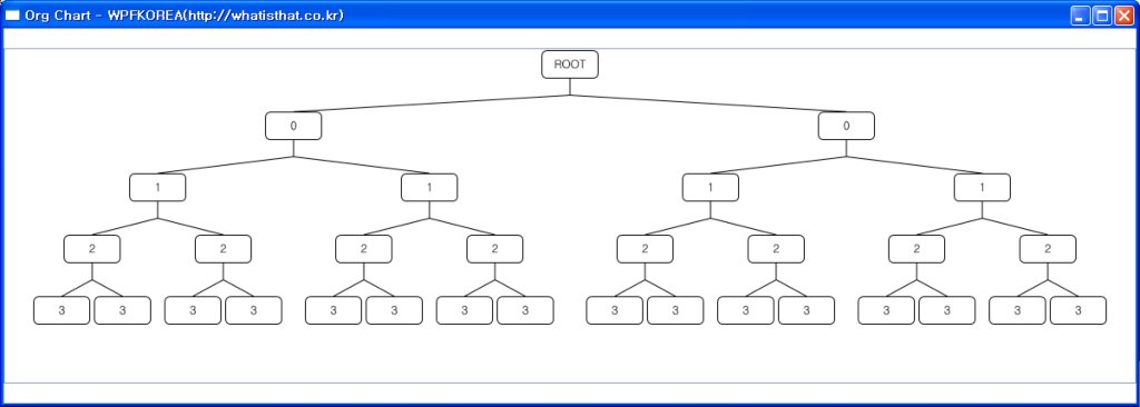
이번 예제에서 여기서 중요한 부분은 Treeview의 Template과 연결선을 그리는 방법으로 포스팅에서는 해당 부분만 다루고 나머지는 소스코드를 첨부하도록 하겠습니다.
먼저 Style부분입니다.
- <STYLE TargetType="TreeViewItem">
- <Setter Property="Template">
- <Setter.Value>
- <ControlTemplate TargetType="TreeViewItem">
- <StackPanel>
- <Border Width="60" Height="30" Background="Transparent" BorderBrush="Black" BorderThickness="1"
- CornerRadius="5" Margin="2,0,2,30" Padding="5" Name="PART_Header">
- <ContentPresenter ContentSource="Header"
- HorizontalAlignment="Center" VerticalAlignment="Center"/>
- </Border>
- <ItemsPresenter/>
- </StackPanel>
- </ControlTemplate>
- </Setter.Value>
- </Setter>
- <Setter Property="ItemsPanel">
- <Setter.Value>
- <ItemsPanelTemplate>
- <StackPanel HorizontalAlignment="Center"
- IsItemsHost="True" Margin="5"
- Orientation="Horizontal" />
- </ItemsPanelTemplate>
- </Setter.Value>
- </Setter>
- </STYLE>
이전에 소개해 드렸던 Architecture View와 비슷함으로 코드 설명은 ArchitectureView를 참고하시기 바랍니다. 다음은 C#코드입니다.
- public static Pen ConnectionPen = new Pen(Brushes.Black, 1);
- protected override void OnRender(DrawingContext DrawingContext)
- {
- if (this.Items.Count > 0)
- DrawConnections(DrawingContext, (TreeViewItem)this.Items[0]);
- base.OnRender(DrawingContext);
- }
- private void DrawConnections(DrawingContext DrawingContext, TreeViewItem ParentNode)
- {
- Point ParentNodePoint = GetHeaderCenterPoint(ParentNode, false);
- double ParentToChildDistance = 999999;
- foreach (FrameworkElement ChildNode in ParentNode.Items)
- {
- Point ChildNodePoint = GetHeaderCenterPoint(ChildNode, true);
- if (ParentToChildDistance > ChildNodePoint.Y - ParentNodePoint.Y)
- ParentToChildDistance = ChildNodePoint.Y - ParentNodePoint.Y;
- }
- if(ParentToChildDistance != 999999)
- DrawingContext.DrawLine(ConnectionPen, new Point(ParentNodePoint.X, ParentNodePoint.Y + ParentToChildDistance / 2), ParentNodePoint);
- foreach (FrameworkElement ChildNode in ParentNode.Items)
- {
- Point ChildNodePoint = GetHeaderCenterPoint(ChildNode, true);
- DrawingContext.DrawLine(ConnectionPen, new Point(ParentNodePoint.X, ParentNodePoint.Y + ParentToChildDistance / 2), ChildNodePoint);
- if (ChildNode.GetType() == typeof(TreeViewItem))
- DrawConnections(DrawingContext, (TreeViewItem)ChildNode);
- }
- }
- private Point GetTopCenterPoint(FrameworkElement Visual)
- {
- return Visual.TranslatePoint(new Point(Visual.ActualWidth / 2, 0), this);
- }
- private Point GetBottomCenterPoint(FrameworkElement Visual)
- {
- return Visual.TranslatePoint(new Point(Visual.ActualWidth / 2, Visual.ActualHeight), this);
- }
- private Point GetHeaderCenterPoint(FrameworkElement Control, bool IsTopCenter)
- {
- if(IsTopCenter)
- return GetTopCenterPoint(GetHeader(Control));
- else
- return GetBottomCenterPoint(GetHeader(Control));
- }
- private FrameworkElement GetHeader(FrameworkElement Control)
- {
- FrameworkElement ResultControl = (VisualTreeHelper.GetChild(Control, 0) as FrameworkElement).FindName("PART_Header") as FrameworkElement;
- return ResultControl;
- }
public static Pen ConnectionPen = new Pen(Brushes.Black, 1);

protected override void OnRender(DrawingContext DrawingContext)
{

    if (this.Items.Count > 0)
        DrawConnections(DrawingContext, (TreeViewItem)this.Items[0]);
    base.OnRender(DrawingContext);
}


private void DrawConnections(DrawingContext DrawingContext, TreeViewItem ParentNode)
{

    Point ParentNodePoint = GetHeaderCenterPoint(ParentNode, false);

    double ParentToChildDistance = 999999;
    foreach (FrameworkElement ChildNode in ParentNode.Items)
    {
        Point ChildNodePoint = GetHeaderCenterPoint(ChildNode, true);

        if (ParentToChildDistance > ChildNodePoint.Y - ParentNodePoint.Y)
            ParentToChildDistance = ChildNodePoint.Y - ParentNodePoint.Y;
    }

    if(ParentToChildDistance != 999999)
        DrawingContext.DrawLine(ConnectionPen, new Point(ParentNodePoint.X, ParentNodePoint.Y + ParentToChildDistance / 2), ParentNodePoint);

    foreach (FrameworkElement ChildNode in ParentNode.Items)
    {
        Point ChildNodePoint = GetHeaderCenterPoint(ChildNode, true);

        DrawingContext.DrawLine(ConnectionPen, new Point(ParentNodePoint.X, ParentNodePoint.Y + ParentToChildDistance / 2), ChildNodePoint);

        if (ChildNode.GetType() == typeof(TreeViewItem))
            DrawConnections(DrawingContext, (TreeViewItem)ChildNode);
    }

}


private Point GetTopCenterPoint(FrameworkElement Visual)
{
    return Visual.TranslatePoint(new Point(Visual.ActualWidth / 2, 0), this);
}

private Point GetBottomCenterPoint(FrameworkElement Visual)
{
    return Visual.TranslatePoint(new Point(Visual.ActualWidth / 2, Visual.ActualHeight), this);
}

private Point GetHeaderCenterPoint(FrameworkElement Control, bool IsTopCenter)
{
    if(IsTopCenter)
        return GetTopCenterPoint(GetHeader(Control));
    else
        return GetBottomCenterPoint(GetHeader(Control));
}


private FrameworkElement GetHeader(FrameworkElement Control)
{
    FrameworkElement ResultControl = (VisualTreeHelper.GetChild(Control, 0) as FrameworkElement).FindName("PART_Header") as FrameworkElement;

    return ResultControl;
}
TreeView가 랜더링 될때 각각의 노드들의 위치를 얻고 해당 부모와 자식 노드를 연결짖는 작업을 합니다. 노드의 Header부분의 위치를 구해야 함으로 Template에 헤더의 이름을 PART_Header라고 지정한뒤 VisualTreeHelper.GetChild를 사용하여 Template의 객체를 찾았습니다. 그리고 각노드들의 Treeview로부터의 상대 좌표를 얻기 위해서 Visual.TransaltePoint사용했습니다.
기타 궁금하신 사항이나 질문은 리플이나 메일 주시면 답변해드리도록 하겠습니다.
아래는 소스코드입니다. (OrgChart를 이용한 SearchEngine을 구현하던중이라 프로젝트 이름이 SearchTree입니다 -_-이점은 그냥 넘어가주세요~)

안녕하세요. 이번시간에는 기존의 WinForm에서 사용하던 Clone메서드를 WPF에서는 어떻게 사용하는지에 대해 알아보도록 하겠습니다. WPF에서는 특별하게 Clone 메서드를 제공하고 있지 않기때문에 Clone 메서드를 직접 구현 해야 합니다. 프로젝트를 하다가 생각나서 구현해놨던건데 알려드리면 유용할것 같아 포스팅합니다..
저같은 경우는 방법이야 여러가지가 있겠지만, 저같은 경우는 간단하게 UIElement객체를 XAML로 Export하고 다시 해당 객체를 Import하는 방식으로 사용합니다. 생각보다 부하가 심할 수 도 있는 부분이긴하나, 간단하게 한두번 정도 사용하기에는 큰 무리는 없을 것으로 보입니다.
아래는 제가 사용하는 CloneElement 메서드 소스코드입니다.
- public static UIElement CloneElement(UIElement Source)
- {
- if (Source == null) return null;
- string XAML = System.Windows.Markup.XamlWriter.Save(Source);
- System.IO.StringReader StringReader = new System.IO.StringReader(XAML);
- System.Xml.XmlReader xmlReader = System.Xml.XmlTextReader.Create(StringReader);
- return (UIElement)System.Windows.Markup.XamlReader.Load(xmlReader);
- }
        public static UIElement CloneElement(UIElement Source)
        {

            if (Source == null) return null;

            string XAML = System.Windows.Markup.XamlWriter.Save(Source);

            System.IO.StringReader StringReader = new System.IO.StringReader(XAML);
            System.Xml.XmlReader xmlReader = System.Xml.XmlTextReader.Create(StringReader);

            return (UIElement)System.Windows.Markup.XamlReader.Load(xmlReader);

}- Button OriginalButton = new Button();
- Button CloneButton = CloneElement(OriginalButton) as Button;
            Button OriginalButton = new Button();
            Button CloneButton = CloneElement(OriginalButton) as Button;
간단히 복권을 긁는 효과를 구현 해보도록 하겠습니다. 아래는 시연 동영상입니다.
- <GRID Width="250" Height="250" Background="Red">
- <IMG height=250 width=250 Source="PICTURE.JPG">
- <WRAPPANEL>
- <WRAPPANEL.RESOURCES>
- <STYLE TargetType="Rectangle">
- <Setter Property="Fill" Value="Black"/>
- <Setter Property="Width" Value="25"/>
- <Setter Property="Height" Value="25"/>
- <Style.Triggers>
- <EventTrigger RoutedEvent="Rectangle.MouseEnter">
- <EventTrigger.Actions>
- <BeginStoryboard>
- <Storyboard Storyboard.TargetProperty="(Rectangle.Opacity)">
- <DoubleAnimation To="0" Duration="0:0:0.5"/>
- <ColorAnimation To="White" Duration="0:0:0.5"
- Storyboard.TargetProperty="(Rectangle.Fill).(SolidColorBrush.Color)"/>
- </Storyboard>
- </BeginStoryboard>
- </EventTrigger.Actions>
- </EventTrigger>
- </Style.Triggers>
- </STYLE>
- </WRAPPANEL.RESOURCES>
- <RECTANGLE /> <RECTANGLE /> <RECTANGLE /> <RECTANGLE /> <RECTANGLE />
- <RECTANGLE /> <RECTANGLE /> <RECTANGLE /> <RECTANGLE /> <RECTANGLE />
- <RECTANGLE /> <RECTANGLE /> <RECTANGLE /> <RECTANGLE /> <RECTANGLE />
- <RECTANGLE /> <RECTANGLE /> <RECTANGLE /> <RECTANGLE /> <RECTANGLE />
- <RECTANGLE /> <RECTANGLE /> <RECTANGLE /> <RECTANGLE /> <RECTANGLE />
- <RECTANGLE /> <RECTANGLE /> <RECTANGLE /> <RECTANGLE /> <RECTANGLE />
- <RECTANGLE /> <RECTANGLE /> <RECTANGLE /> <RECTANGLE /> <RECTANGLE />
- <RECTANGLE /> <RECTANGLE /> <RECTANGLE /> <RECTANGLE /> <RECTANGLE />
- <RECTANGLE /> <RECTANGLE /> <RECTANGLE /> <RECTANGLE /> <RECTANGLE />
- <RECTANGLE /> <RECTANGLE /> <RECTANGLE /> <RECTANGLE /> <RECTANGLE />
- <RECTANGLE /> <RECTANGLE /> <RECTANGLE /> <RECTANGLE /> <RECTANGLE />
- <RECTANGLE /> <RECTANGLE /> <RECTANGLE /> <RECTANGLE /> <RECTANGLE />
- <RECTANGLE /> <RECTANGLE /> <RECTANGLE /> <RECTANGLE /> <RECTANGLE />
- <RECTANGLE /> <RECTANGLE /> <RECTANGLE /> <RECTANGLE /> <RECTANGLE />
- <RECTANGLE /> <RECTANGLE /> <RECTANGLE /> <RECTANGLE /> <RECTANGLE />
- <RECTANGLE /> <RECTANGLE /> <RECTANGLE /> <RECTANGLE /> <RECTANGLE />
- <RECTANGLE /> <RECTANGLE /> <RECTANGLE /> <RECTANGLE /> <RECTANGLE />
- <RECTANGLE /> <RECTANGLE /> <RECTANGLE /> <RECTANGLE /> <RECTANGLE />
- <RECTANGLE /> <RECTANGLE /> <RECTANGLE /> <RECTANGLE /> <RECTANGLE />
- <RECTANGLE /> <RECTANGLE /> <RECTANGLE /> <RECTANGLE /> <RECTANGLE />
- </WRAPPANEL>
- </GRID>
가장먼저 눈에 띄는 부분이 엄청난 분량의 Rectangle입니다. 활용 가능성을 보여드리기 위해 이렇게 많은 객체를 사용했지만 저렇게 사용하는 것이 최적화된 코드는 아니라는걸 알려드립니다! 위 코드에서 가장 중요한 부분은 Rectangle객체를 하나의 Style로 지정하여 마우스 오버가 될때 DoubleAnimation 과 ColorAnimation을 사용해서 뒷부분이 밝혀지는 효과를 주는데 있습니다.
기타 질문은 리플이나 메일로 보내주시면 답변해드리겠습니다.
예전에 인터넷에서 플래시로 한번 봤었던 내용인데 실습용으로 괜찮을거 같아서 한번 구현해 보았습니다. 하나의 그림을 총 4부분으로 나누어서 출력하고 마우스의 움직임에 따라서 마우스와의 거리에 따라 영역이 따라오는 속도를 조절하는 내용입니다. 마땅히 떠오르는 제목이 없어서.. 다이나믹 마우스 무브 애니메이션이라고 했지만.. 그냥 마우스 따라다니는 그림 정도라 할수도 있겠습니다..
아래는 시연 동영상 입니다.
컴퓨터 화면을 촬영한것이라서 많이 버벅대는 느낌이 있어서 조금 아쉽습니다..
아래는 XAML 소스코드입니다.
- <WINDOW title="Mouse Move Here!! - WPF KOREA!!" xmlns="http://schemas.microsoft.com/winfx/2006/xaml/presentation" ResizeMode="NoResize" xmlns:x="http://schemas.microsoft.com/winfx/2006/xaml" x:Class="MouseOver.Window1" Width="400" Height="450" Background="White">
- <CANVAS Width="400" Height="400">
- <CANVAS.RESOURCES>
- <STYLE TargetType="Image">
- <Setter Property="Width" Value="400"/>
- <Setter Property="Height" Value="400"/>
- <Setter Property="Source" Value="character.JPG"/>
- </STYLE>
- <STYLE TargetType="Canvas">
- <Setter Property="Background" Value="White"/>
- <Setter Property="Width" Value="400"/>
- <Setter Property="Height" Value="400"/>
- </STYLE>
- </CANVAS.RESOURCES>
- <CANVAS MouseMove="ImageTop_MouseMove">
- <IMG x:Name="ImageTop">
- <CANVAS.CLIP>
- <RECTANGLEGEOMETRY Rect="0,0,400,100" />
- </CANVAS.CLIP>
- </CANVAS>
- <CANVAS MouseMove="ImageTopBottom_MouseMove">
- <IMG x:Name="ImageTopBottom">
- <CANVAS.CLIP>
- <RECTANGLEGEOMETRY Rect="0,100,400,100" />
- </CANVAS.CLIP>
- </CANVAS>
- <CANVAS MouseMove="ImageBottomTop_MouseMove">
- <IMG x:Name="ImageBottomTop">
- <CANVAS.CLIP>
- <RECTANGLEGEOMETRY Rect="0,200,400,100" />
- </CANVAS.CLIP>
- </CANVAS>
- <CANVAS MouseMove="ImageBottom_MouseMove">
- <IMG x:Name="ImageBottom">
- <CANVAS.CLIP>
- <RECTANGLEGEOMETRY Rect="0,300,400,100" />
- </CANVAS.CLIP>
- </CANVAS>
- </CANVAS>
- </WINDOW>
아래는 C# 소스코드입니다.
- public partial class Window1 : Window
- {
- public Window1()
- {
- InitializeComponent();
- Canvas.SetLeft(ImageTop, 0);
- Canvas.SetLeft(ImageTopBottom, 0);
- Canvas.SetLeft(ImageBottomTop, 0);
- Canvas.SetLeft(ImageBottom, 0);
- }
- DoubleAnimation TopMoveAnimation = new DoubleAnimation();
- DoubleAnimation TopBottomMoveAnimation = new DoubleAnimation();
- DoubleAnimation BottomTopMoveAnimation = new DoubleAnimation();
- DoubleAnimation BottomMoveAnimation = new DoubleAnimation();
- private void ImageBottom_MouseMove(object sender, MouseEventArgs e)
- {
- SetAnimationPosition(e.GetPosition(this).X);
- TopMoveAnimation.SpeedRatio = 0.5;
- TopBottomMoveAnimation.SpeedRatio = 1;
- BottomTopMoveAnimation.SpeedRatio = 2;
- BottomMoveAnimation.SpeedRatio = 4;
- BeginAnimation();
- }
- private void ImageBottomTop_MouseMove(object sender, MouseEventArgs e)
- {
- SetAnimationPosition(e.GetPosition(this).X);
- TopMoveAnimation.SpeedRatio = 0.5;
- TopBottomMoveAnimation.SpeedRatio = 2;
- BottomTopMoveAnimation.SpeedRatio = 4;
- BottomMoveAnimation.SpeedRatio = 1;
- BeginAnimation();
- }
- private void ImageTopBottom_MouseMove(object sender, MouseEventArgs e)
- {
- SetAnimationPosition(e.GetPosition(this).X);
- TopMoveAnimation.SpeedRatio = 2;
- TopBottomMoveAnimation.SpeedRatio = 4;
- BottomTopMoveAnimation.SpeedRatio = 1;
- BottomMoveAnimation.SpeedRatio = 0.5;
- BeginAnimation();
- }
- private void ImageTop_MouseMove(object sender, MouseEventArgs e)
- {
- SetAnimationPosition(e.GetPosition(this).X);
- TopMoveAnimation.SpeedRatio = 4;
- TopBottomMoveAnimation.SpeedRatio = 2;
- BottomTopMoveAnimation.SpeedRatio = 1;
- BottomMoveAnimation.SpeedRatio = 0.5;
- BeginAnimation();
- }
- private void SetAnimationPosition(double LeftPosition)
- {
- LeftPosition -= 200;
- TopMoveAnimation.To = LeftPosition;
- TopBottomMoveAnimation.To = LeftPosition;
- BottomTopMoveAnimation.To = LeftPosition;
- BottomMoveAnimation.To = LeftPosition;
- }
- private void BeginAnimation()
- {
- ImageTop.BeginAnimation(Canvas.LeftProperty, TopMoveAnimation, HandoffBehavior.Compose);
- ImageTopBottom.BeginAnimation(Canvas.LeftProperty, TopBottomMoveAnimation, HandoffBehavior.Compose);
- ImageBottomTop.BeginAnimation(Canvas.LeftProperty, BottomTopMoveAnimation, HandoffBehavior.Compose);
- ImageBottom.BeginAnimation(Canvas.LeftProperty, BottomMoveAnimation, HandoffBehavior.Compose);
- }
- }
public partial class Window1 : Window
{
    public Window1()
    {
        InitializeComponent();

        Canvas.SetLeft(ImageTop, 0);
        Canvas.SetLeft(ImageTopBottom, 0);
        Canvas.SetLeft(ImageBottomTop, 0);
        Canvas.SetLeft(ImageBottom, 0);

    }

    DoubleAnimation TopMoveAnimation = new DoubleAnimation();
    DoubleAnimation TopBottomMoveAnimation = new DoubleAnimation();
    DoubleAnimation BottomTopMoveAnimation = new DoubleAnimation();
    DoubleAnimation BottomMoveAnimation = new DoubleAnimation();

    private void ImageBottom_MouseMove(object sender, MouseEventArgs e)
    {
        SetAnimationPosition(e.GetPosition(this).X);

        TopMoveAnimation.SpeedRatio = 0.5;
        TopBottomMoveAnimation.SpeedRatio = 1;
        BottomTopMoveAnimation.SpeedRatio = 2;
        BottomMoveAnimation.SpeedRatio = 4;

        BeginAnimation();
    }

    private void ImageBottomTop_MouseMove(object sender, MouseEventArgs e)
    {
        SetAnimationPosition(e.GetPosition(this).X);

        TopMoveAnimation.SpeedRatio = 0.5;
        TopBottomMoveAnimation.SpeedRatio = 2;
        BottomTopMoveAnimation.SpeedRatio = 4;
        BottomMoveAnimation.SpeedRatio = 1;

        BeginAnimation();
    }

    private void ImageTopBottom_MouseMove(object sender, MouseEventArgs e)
    {
        SetAnimationPosition(e.GetPosition(this).X);

        TopMoveAnimation.SpeedRatio = 2;
        TopBottomMoveAnimation.SpeedRatio = 4;
        BottomTopMoveAnimation.SpeedRatio = 1;
        BottomMoveAnimation.SpeedRatio = 0.5;

        BeginAnimation();
    }

    private void ImageTop_MouseMove(object sender, MouseEventArgs e)
    {
        SetAnimationPosition(e.GetPosition(this).X);

        TopMoveAnimation.SpeedRatio = 4;
        TopBottomMoveAnimation.SpeedRatio = 2;
        BottomTopMoveAnimation.SpeedRatio = 1;
        BottomMoveAnimation.SpeedRatio = 0.5;

        BeginAnimation();
    }

    private void SetAnimationPosition(double LeftPosition)
    {
        LeftPosition -= 200;
        TopMoveAnimation.To = LeftPosition;
        TopBottomMoveAnimation.To = LeftPosition;
        BottomTopMoveAnimation.To = LeftPosition;
        BottomMoveAnimation.To = LeftPosition;
    }

    private void BeginAnimation()
    {
        ImageTop.BeginAnimation(Canvas.LeftProperty, TopMoveAnimation, HandoffBehavior.Compose);
        ImageTopBottom.BeginAnimation(Canvas.LeftProperty, TopBottomMoveAnimation, HandoffBehavior.Compose);
        ImageBottomTop.BeginAnimation(Canvas.LeftProperty, BottomTopMoveAnimation, HandoffBehavior.Compose);
        ImageBottom.BeginAnimation(Canvas.LeftProperty, BottomMoveAnimation, HandoffBehavior.Compose);
    }
}
간단하게 설명을 하자면, Canvas위에 Image를 영역별로 Clip해서 출력한 뒤 Canvas의 마우스 이벤트에 따라서 Animation을 적용한 것입니다. 수동으로 SpeedRatio를 수정해서 반응속도를 조절했습니다. 보다 자연스러운 Animation을 위해서 BeginAnimation을 호출할 때 HandoffBehavior를 주어서 약간의 관성을 주었습니다. 기타 궁금하신 사항은 리플이나 메일로 주시면 답변 해드리도록 하겠습니다.

이번시간에는 XAML만을 사용하여 쇼핑몰 등에서 사용 가능한 Detail View를 구현해보도록 하겠습니다. (이번에도 역시 정확한 이름짖기가 애매해서 -_- Detail View라고 했습니다.) 아래는 시연 동영상 입니다.
제가 좋아하는 만화중에 하나인 드래곤볼입니다ㅎㅎ 기능에 대해서 설명하자면 화면 왼쪽에는 손오공이 오른쪽에는 베지터라는 메뉴가 있습니다. 해당 메뉴에 마우스를 오버 할 경우 해당 메뉴에서 더 보여주고 싶은 자세한 내용을 포함 할 수 있습니다. 소스코드를 본 뒤 더 자세히 이야기를 해보겠습니다.
- <WINDOW title="DragonBall - WPFKOREA(http://whatisthat.co.kr)" xmlns="http://schemas.microsoft.com/winfx/2006/xaml/presentation" xmlns:x="http://schemas.microsoft.com/winfx/2006/xaml" x:Class="DragonBall.Window1" Width="600" Height="400">
- <WINDOW.RESOURCES>
- <IMAGEBRUSH x:Key="Background" ImageSource="Background.jpg" />
- <STYLE TargetType="Button" x:Key="ProfileBox">
- <Style.Resources>
- <Style TargetType="TextBlock">
- <Setter Property="Foreground" Value="White"/>
- <Setter Property="TextAlignment" Value="Center"/>
- <Setter Property="FontSize" Value="11"/>
- <Setter Property="FontFamily" Value="Trebuchet MS"/>
- <Setter Property="VerticalAlignment" Value="Center"/>
- <Setter Property="HorizontalAlignment" Value="Center"/>
- <Setter Property="Cursor" Value="Hand"/>
- </STYLE>
- </STYLE.RESOURCES>
- <SETTER Value="Black" Property="Background" />
- <SETTER Value="55" Property="Width" />
- <SETTER Value="17.5" Property="Height" />
- <SETTER Property="Template">
- <SETTER.VALUE>
- <CONTROLTEMPLATE>
- <GRID Width="{TemplateBinding Width}" Height="{TemplateBinding Height}" Background="{TemplateBinding Background}">
- <TEXTBLOCK Text="{TemplateBinding Tag}" />
- <CONTENTPRESENTER x:Name="ContentBase" Opacity="0" Content="{TemplateBinding Button.Content}" />
- </GRID>
- <CONTROLTEMPLATE.TRIGGERS>
- <TRIGGER Value="True" Property="Button.IsMouseOver">
- <TRIGGER.ENTERACTIONS>
- <BEGINSTORYBOARD>
- <STORYBOARD Storyboard.TargetName="ContentBase">
- <DOUBLEANIMATION Storyboard.TargetProperty="(Grid.Height)" Duration="0:0:0.5" To="175" />
- <DOUBLEANIMATION Storyboard.TargetProperty="(Canvas.Top)" Duration="0:0:0.5" To="142.5" />
- <DOUBLEANIMATION Storyboard.TargetProperty="Opacity" Duration="0:0:0.5" To="1" />
- </STORYBOARD>
- </BEGINSTORYBOARD>
- </TRIGGER.ENTERACTIONS>
- <TRIGGER.EXITACTIONS>
- <BEGINSTORYBOARD>
- <STORYBOARD Storyboard.TargetName="ContentBase">
- <DOUBLEANIMATION Storyboard.TargetProperty="(Grid.Height)" Duration="0:0:0.5" To="17.5" />
- <DOUBLEANIMATION Storyboard.TargetProperty="(Canvas.Top)" Duration="0:0:0.5" To="300" />
- <DOUBLEANIMATION Storyboard.TargetProperty="Opacity" Duration="0:0:0.5" To="0" />
- </STORYBOARD>
- </BEGINSTORYBOARD>
- </TRIGGER.EXITACTIONS>
- </TRIGGER>
- </CONTROLTEMPLATE.TRIGGERS>
- </CONTROLTEMPLATE>
- </SETTER.VALUE>
- </SETTER>
- </STYLE>
- <STYLE TargetType="Button" x:Key="LeftProfileBox" BasedOn="{StaticResource ProfileBox}">
- <Style.Triggers>
- <Trigger Property="IsMouseOver" Value="True">
- <Trigger.EnterActions>
- <BeginStoryboard>
- <Storyboard>
- <DoubleAnimation To="200" Duration="0:0:0.5" BeginTime="0:0:0.5" Storyboard.TargetProperty="(Grid.Width)"/>
- <DoubleAnimation To="30" Duration="0:0:0.5" BeginTime="0:0:0.5" Storyboard.TargetProperty="(Canvas.Left)"/>
- </Storyboard>
- </BeginStoryboard>
- </Trigger.EnterActions>
- <Trigger.ExitActions>
- <BeginStoryboard>
- <Storyboard>
- <DoubleAnimation To="55" Duration="0:0:0.5" BeginTime="0:0:0.5" Storyboard.TargetProperty="(Grid.Width)"/>
- <DoubleAnimation To="175" Duration="0:0:0.5" BeginTime="0:0:0.5" Storyboard.TargetProperty="(Canvas.Left)"/>
- </Storyboard>
- </BeginStoryboard>
- </Trigger.ExitActions>
- </Trigger>
- </Style.Triggers>
- </STYLE>
- <STYLE TargetType="Button" x:Key="RightProfileBox" BasedOn="{StaticResource ProfileBox}">
- <Style.Triggers>
- <Trigger Property="IsMouseOver" Value="True">
- <Trigger.EnterActions>
- <BeginStoryboard>
- <Storyboard>
- <DoubleAnimation To="200" Duration="0:0:0.5" BeginTime="0:0:0.5" Storyboard.TargetProperty="(Grid.Width)"/>
- </Storyboard>
- </BeginStoryboard>
- </Trigger.EnterActions>
- <Trigger.ExitActions>
- <BeginStoryboard>
- <Storyboard>
- <DoubleAnimation To="55" Duration="0:0:0.5" BeginTime="0:0:0.5" Storyboard.TargetProperty="(Grid.Width)"/>
- </Storyboard>
- </BeginStoryboard>
- </Trigger.ExitActions>
- </Trigger>
- </Style.Triggers>
- </STYLE>
- </WINDOW.RESOURCES>
- <GRID>
- <CANVAS Width="511" Height="328" Background="{StaticResource Background}">
- <BUTTON style="StaticResource: " Tag="Son Goku" Canvas.Top="300" Canvas.Left="175">
- <IMG height=175 width=200 Source="Goku.jpg">
- </BUTTON>
- <BUTTON style="StaticResource: " Tag="Vegeta" Canvas.Top="300" Canvas.Left="275">
- <IMG height=175 width=200 Source="Vegeta.jpg">
- </BUTTON>
- </CANVAS>
- </GRID>
- </WINDOW>
코드가 급하게 포스팅한 내용이라 코드가 상당히 지저분 하지만 전반적인 작동원리에 대해서 이해하시는데에는 크게 문제는 없을 것 같습니다. 메뉴는 기본적으로 Button을 사용하기 때문에 Button의 Style을 적용합니다. MouseOver상태에 따라서 보여줄 객체를 정하기 위해서 Trigger에 IsMouseOver Property를 적용했습니다. 두 매뉴가 확장댈때의 위치가 다르기 때문에 Left와 Right를 기존의 Style을 상속받아 확장될때의 크기를 다시 적용했습니다.
- <GRID Width="{TemplateBinding Width}" Height="{TemplateBinding Height}" Background="{TemplateBinding Background}">
- <TEXTBLOCK Text="{TemplateBinding Tag}" />
- <CONTENTPRESENTER x:Name="ContentBase" Opacity="0" Content="{TemplateBinding Button.Content}" />
- </GRID>
Button Style부분의 코드입니다. 작은 상태에서의 보여줄 텍스트는 Tag를 Template Binding하여 표현하고 확장됬을경우 보여줄 컨텐츠를 보여주기 위해 ContentPresenter를 사용했습니다. ContentPresenter의 경우 기본적으로 Opacity가 0이여서 출력되지 않으며 MouseOver시에 Opacity가 변경됩니다.
- <BUTTON style="StaticResource: " Tag="Son Goku" Canvas.Top="300" Canvas.Left="175">
- <IMG height=175 width=200 Source="Goku.jpg">
- </BUTTON>
- <BUTTON style="StaticResource: " Tag="Vegeta" Canvas.Top="300" Canvas.Left="275">
- <IMG height=175 width=200 Source="Vegeta.jpg">
- </BUTTON>
사용할 때는 위와 같이 Tag Property에 버튼의 이름을 정의하고 Content Property에 Detail View에서의 컨텐츠를 추가 하면됩니다. 급하게 포스팅하느라 내용이 약간 어수선 한 부분이 있지만 시간이 되면 다시 정리하도록 하겠습니다. 자세한 내용이나 질문은 댓글이나 메일로 보내주시기 바랍니다.

대략 보면 뭐하는 녀석이구나 집작은 모두 하시겠지만, 설명을 하자면.. 마우스를 올려놓았을 때 해당 부분의 일정 영역이 뿌옇게 되고 회전한뒤 원상복귀 되는 내용입니다. 실제 Application에 이러한 기능을 구현해서 사용할지는 의문이지만, Interactive Design과 같은 분야에서는 응용가능 한 예제라 생각됩니다.
아래는 전체 소스코드입니다.
<WINDOW title="WPF KOREA" xmlns="http://schemas.microsoft.com/winfx/2006/xaml/presentation" x:Class="Rotation.Window1" xmlns:x="http://schemas.microsoft.com/winfx/2006/xaml" Height="300" Width="300">
<GRID>
<GRID.RESOURCES>
<IMAGEBRUSH x:Key="WonderGirls" ImageSource="WonderGirls.jpg" />
<STYLE TargetType="Rectangle">
<Setter Property="Width" Value="200"/>
<Setter Property="Height" Value="200"/>
<Setter Property="RenderTransformOrigin" Value="0.5,0.5"/>
<Setter Property="Fill" Value="{StaticResource WonderGirls}"/>
<Setter Property="RenderTransform">
<Setter.Value>
<RotateTransform/>
</Setter.Value>
</Setter>
<Setter Property="BitmapEffect">
<Setter.Value>
<BlurBitmapEffect Radius="0"/>
</Setter.Value>
</Setter>
<Style.Triggers>
<EventTrigger RoutedEvent="Rectangle.MouseEnter">
<EventTrigger.Actions>
<BeginStoryboard>
<Storyboard >
<DoubleAnimation To="360" FillBehavior="Stop"
AccelerationRatio="0.2"
Storyboard.TargetProperty="(Rectangle.RenderTransform).(RotateTransform.Angle)"/>
<DoubleAnimation To="5" FillBehavior="Stop"
AutoReverse="True" Duration="0:0:0.5"
Storyboard.TargetProperty="(Rectangle.BitmapEffect).(BlurBitmapEffect.Radius)"/>
</Storyboard>
</BeginStoryboard>
</EventTrigger.Actions>
</EventTrigger>
</Style.Triggers>
</STYLE>
</GRID.RESOURCES>
<RECTANGLE>
<RECTANGLE.CLIP>
<ELLIPSEGEOMETRY Center="100 100" RadiusX="100" RadiusY="100" />
</RECTANGLE.CLIP>
</RECTANGLE>
<RECTANGLE>
<RECTANGLE.CLIP>
<ELLIPSEGEOMETRY Center="100 100" RadiusX="75" RadiusY="75" />
</RECTANGLE.CLIP>
</RECTANGLE>
<RECTANGLE>
<RECTANGLE.CLIP>
<ELLIPSEGEOMETRY Center="100 100" RadiusX="50" RadiusY="50" />
</RECTANGLE.CLIP>
</RECTANGLE>
<RECTANGLE>
<RECTANGLE.CLIP>
<ELLIPSEGEOMETRY Center="100 100" RadiusX="25" RadiusY="25" />
</RECTANGLE.CLIP>
</RECTANGLE>
</GRID>
</WINDOW>
소스상에 특별히 어려운 부분이 없으므로 설명은 생략 하도록 하고, 질문 있으신분은 리플로 말씀해주시기 바랍니다. 추가로 이번 코드는 이전에 DockBar만들기(http://whatisthat.co.kr/71) 라는 주제로 다루어 진 내용이 많이 포함되어 함께 참고 하시면 좋을것 같습니다.
